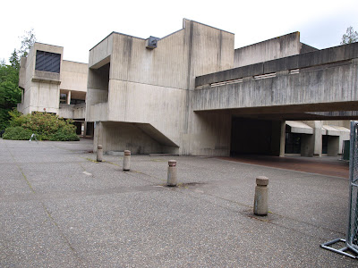
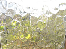
Evergreen was founded in 1967 with most of the buildings being finished from 1970-73. As you may or may not know, but will surely, surely pick up on, this was the heyday of the architectural style known as Brutalism, a style which especially lent itself to large institutional buildings. What is Brutalism? I think this image of a cast-in-place concrete wall pretty much sums it up.

A Brief History of Buildings with Flat Roofs
Brutalism is the spiritual child of the Modernism that emerged in the 1920s and 30s chiefly characterized by Le Corbusier in France and the Bauhaus school in Germany. The Bauhaus moved around Germany several times in its 24 years before the Nazis ultimately shut it down, causing many of the architects to flee the country, thus enabling the spread of their ideas worldwide. This new style had become known as the International Style, because it was supposed to transcend local traditions and simplify architecture so as to be universally applicable. One of the principle architects of the Bauhaus, Ludwig Mies van der Rohe, emigrated to New York and more or less invented the skyscraper as we know it today. So if you don't like Modernist architecture, yes, now you have one more thing to blame the Nazis for.

Le Corbusier's monumental Villa Savoye. Poissy, France, 1928.
Incidentally, Le Corbusier visited the USSR during the 30s and cites this Soviet Constructivist housing project as an influence on his work (Narkomfin Building, Moscow, 1932). According to Wikipedia, the project was designed to create space for / force inhabitants into (depending on your view of Soviet style Communism) communal living arrangements. So, you also have the Communists to blame for Modern architecture.

The central adage of Modernism was "form follows function". Modernists sought to simplify architecture to its pure state. They believed in the honest use of materials, which means no unnecessary ornamentation or attempts to disguise the use of a material in construction. A good example of something that would send Le Corbusier spinning in his, presumably simple, unadorned grave are the fake plastic shutters you see on houses nowadays, hearkening back to the form of exterior wood shutters that once were functional aspects of homes and are now simply placeholders suggesting a form which no longer has application. Form follows function demands that architects not design something just because it looks good, but rather because it has a purpose, and the look should emerge from that purpose.
You should be beginning to see how we get from innocuous drawings and Utopian ideals to the giant glass boxes that are most commercial buildings in the US as well as, yes, Brutalism. It's an interesting history and the ideals were surprising to me, since I was initially so adverse to the buildings they produced.
Here are the buildings of the The Evergreeen State College:


In my opinion, they alternately look like post-apocalyptic bunkers and Star Wars machines. I can imagine Walkers emerging from the trees surrounding the field of the sports complex or Mad Max bandits speeding through the passageways between buildings on motorcycles. And I guess that's what it is about Brutalism, it's so elemental.
The buildings sit very heavy on the land. They are stark and simple. They perform their functions without distraction. And the entire campus is this way. (Well, almost the entire campus. There are temporary construction trailers hiding behind the library and the more traditional cedar longhouse reflecting the school's connection to a local tribe.) The campus is very uniform in the way of something planned and carried out all at once in one specific period and style - a trait you won't find at most older universities.
The overall effect is somewhat overbearing, but it's strangely balanced by the incredible natural beauty of the site - the school's property being around 1000 acres, most of it sizable evergreen forest. Here's an example of a pathway between buildings.

One building to especially take note of is the newly remodeled (2004) Seminar 2 Building.

It is LEED certified, has green roofs, uses 10% recycled materials including fly ash in concrete, salvaged gym floor panels, etc... The building is laid out in 5 pods that connect with walkways spanning four floors, creating something like the impression of a tree house when seen from the ground. The interior of the one pod I went in to use the bathroom was well lite with natural light from a light well that cut through the 3 floors above. The stairway was similarly cloaked in an obscured glass or Plexiglas skin that allowed in natural light.


One of the drawbacks I found with Seminar 2 was that the wood panels on the siding seemed uneasy to me. I'm sure they were intended to lend some warmth to the exterior and update the style in light of its critical reception over the 30 years prior - and I can't quite place my finger on what it is about the panels (certainly a darker wood wouldn't improve my impression... perhaps a more consistent pattern to where the wood was placed might), but they seem uncomfortable, like they weren't integrated into the rest of the facade and were simply squished into the concrete while it dried. I don't know what else to say about that, because I like the idea of the warmth wood brings to the concrete, and they did included some interesting metal art embedded in some of the panels.

The other more obvious and somewhat shocking detriment to the building is the way it wears its age. This is a 6 year old structure, and already we see the ugly dark stains from rain run off left on the concrete as well as rust on the bottom of the walkways and railing. I found this problem with the concrete reflected elsewhere on campus, perhaps exacerbated by the Modernist tendency not to include external drainage (gutters) on roofs.


I found that I liked the experience of Seminar 2 much more than the rest of campus. I liked the interplay of space in the walkways between building and I especially liked the lush courtyard that tied it all together.


I think the Seminar 2 courtyard captures the ideal of Evergreen's campus and perhaps Brutalism in general. The buildings rest on the landscape like rock formations, heavy and simple, at times suggesting boulders half-buried in a field. If we look past our initial intuitive aversion to cast concrete surfaces (which, judging from my own and my families responses I take to be a pretty consistent standard), it really seems that the built structures are paying respect to the natural by not drawing attention from, but deflecting the visual interest to the beauty of the trees and landscape that are worked in to the plan so well. It's funny, I guess, that because the structures are so stark and brutal, our attention is attracted to them as a statement of intellectual theory or ego by the architect, whereas we wouldn't think twice about more traditional vernacular buildings with gabled roofs and wood siding resting easily amidst the trees. But then, I suppose there is a reason Brutalism hasn't exactly caught on.
In the end, I found I was able to appreciate the structures for what they were, although never without feeling like I was in some dystopian post-apocalyptic landscape. There is something about the proximity of concrete monoliths and lush nature that always makes me think: This is what the world will look like 30 or 40 years after we inevitably render our species extinct and nature begins to crawl its way past our defenses. There is some suggestion of the immediacy and the power of nature in this type of architecture that wouldn't have occurred to me before. I certainly agree with much of the intention behind the early Modernist architecture, but I can't help reacting against the emotional coldness of it's textures and surfaces. I suppose that the concrete block or glass cube is too pure in its form and that there are ways to merge modern and vernacular styles that improve upon both traditions.

1 comment:
I go to this school and have to say your assessment is far too generous. This place looks like a prison. When I first came to campus and saw the wood panels on Seminar 2 I figured that either someone had smashed out the windows and these panels were a temporary measure or that the building was in the middle of a remodel.
Post a Comment